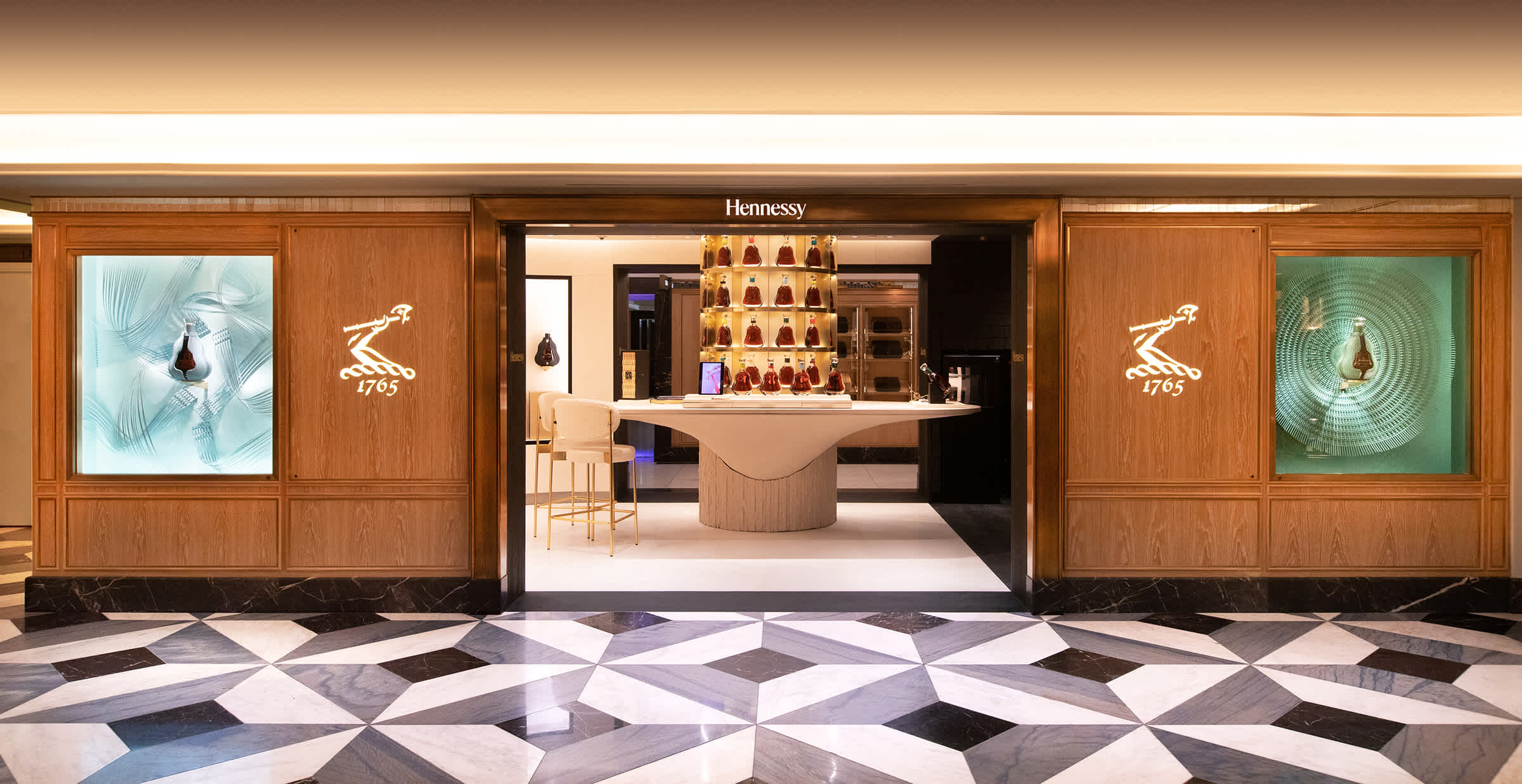
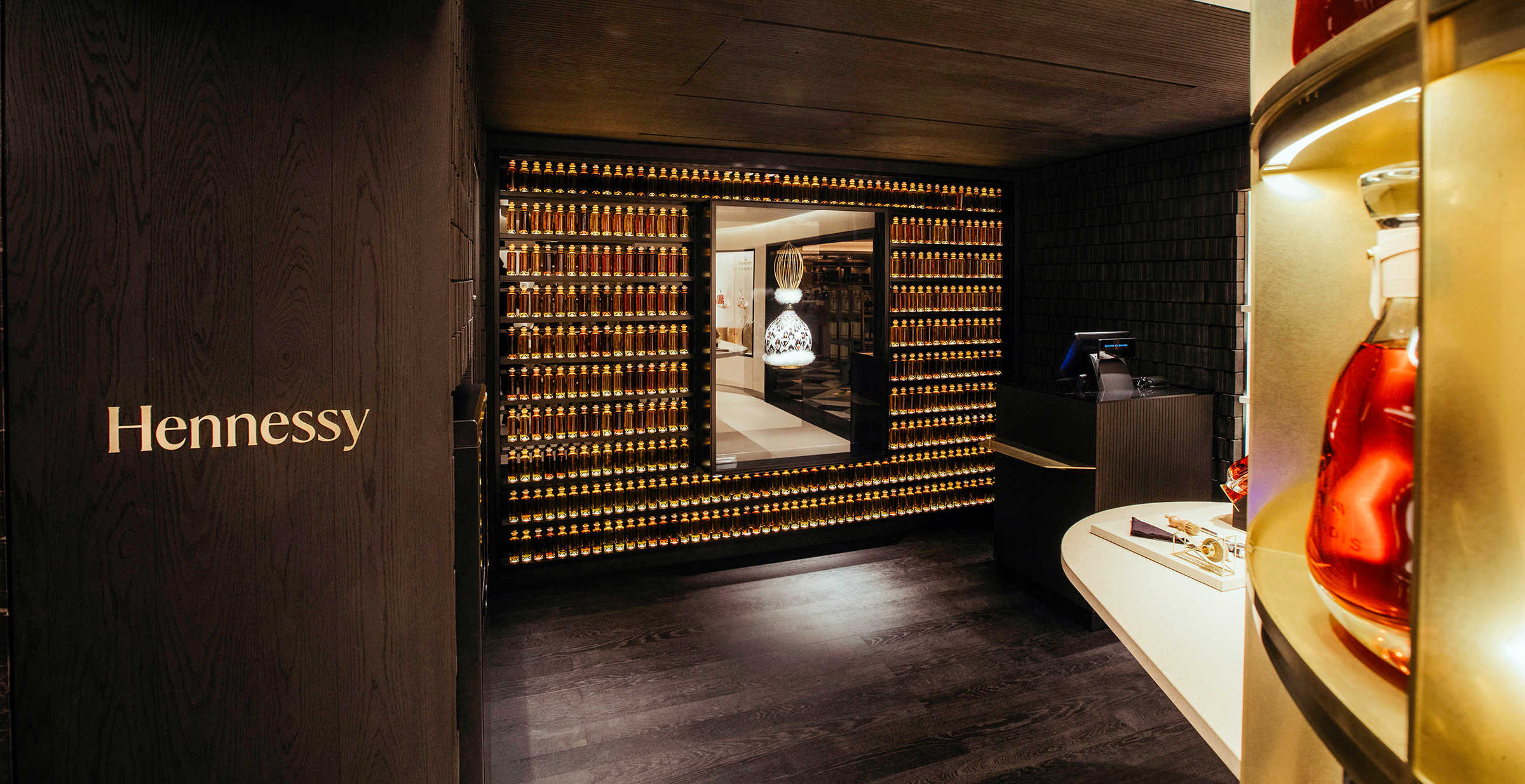
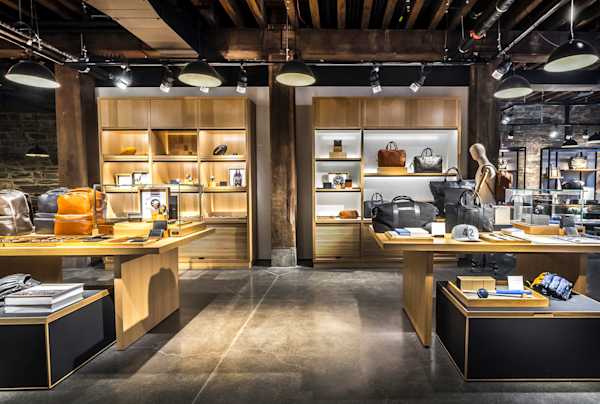
Throughout the space, multiple layers of light combine to create a “liquid atmosphere.”
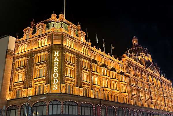
History meets luxury at Hennessy’s new flagship boutique in Harrods London, where a liquid-inspired lighting concept enhances a minimalist architectural design, reinforcing the brand’s core identity while ushering it into the modern marketplace. For L’Observatoire International’s first collaboration with Hennessy, the design team worked alongside architects Cigüe and INK Associates to develop a lighting scheme that highlights the brand’s iconic offerings, and encourages user flow from the storied Harrods location into and throughout the 330-square-foot retail space.
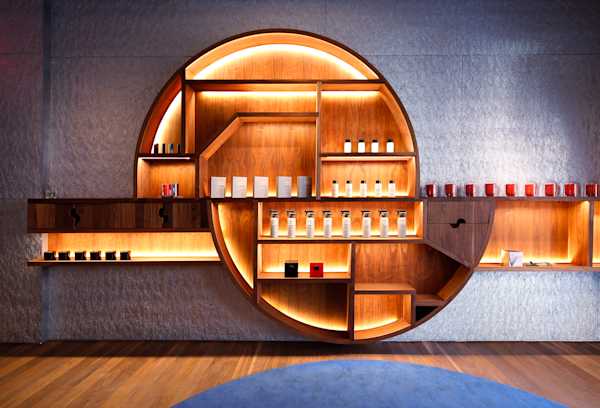
Within the store, a clean, minimal palette sets the tone, with monochrome yet textural materials such as wood and stone evoking the evolution of Hennessy containers—from their original cognac barrels to today’s distinctive faceted glass bottles. Throughout the space, multiple layers of light combine to create a “liquid atmosphere.” To achieve the effect, the design team focused on lighting the bottles and indirectly illuminating the space with amber light, contrasting with the store’s strong black and white color palette, resulting in an ambience that’s inviting and fluid for visitors, and that seamlessly highlights the products on display. The first layer of ambient illumination utilizes indirect lighting integrated into architecture and millwork to wash surfaces and textures, providing an overall diffuse glow. Outside the store, for example, two different entry façades are defined by illuminated logo signage to increase brand visibility, combined with general lighting that enhances flow into the space. Each exterior entry point also contains illuminated recessed display niches that can be used on a rotational basis to showcase the brand’s products, as well as for collaborations or temporary installations from visiting artists. Once inside, the theme continues with additional niches highlighted by diffuse integrated lighting, as well as a series of cove fixtures that wash shelves and display tables.
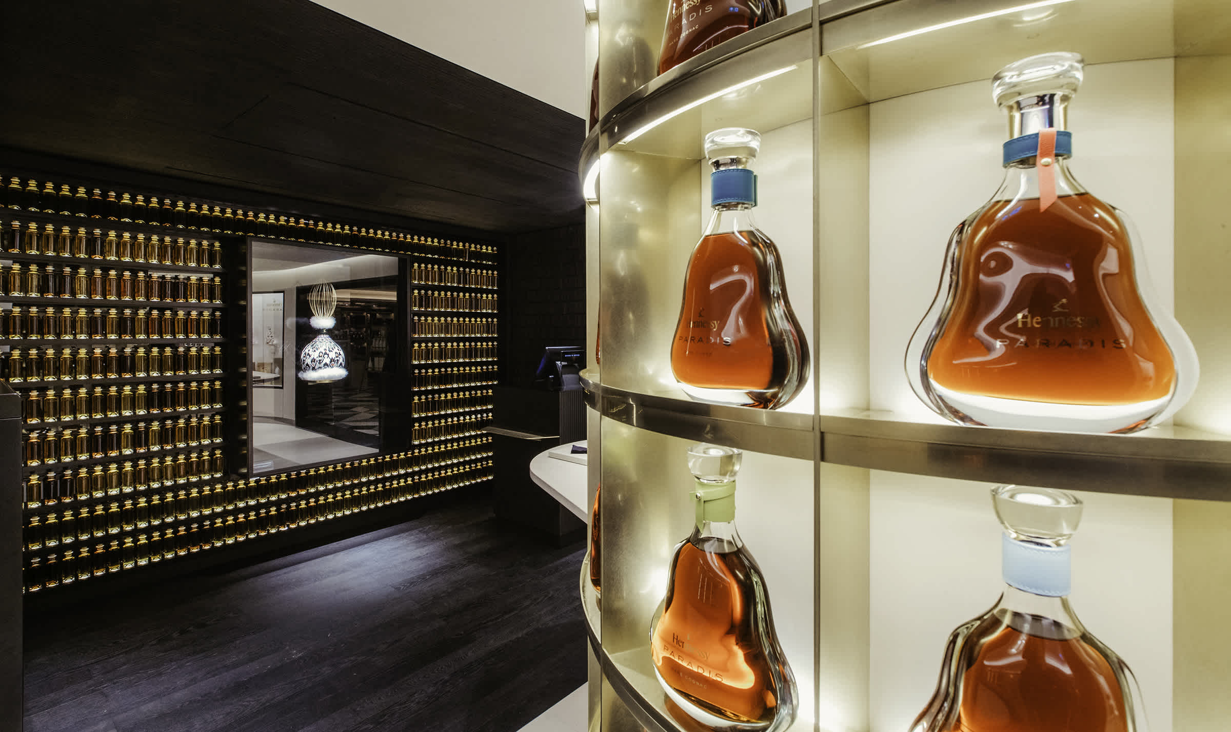
Next, a layer of accent lighting creates zones of light around tabletops, and emphasizes key features and displays. Studies and mock-ups were conducted to determine how accent lighting could be layered on top of the base layer of ambient light, resulting in a unique mix of strategies that best showcase the boutique’s offerings. Ceiling-mounted accent spotlights, for example, highlight the tasting table set around a central display column showcasing Hennessy’s iconic Paradis bottles, with multiple layers of soft ambient light creating a strong contrast and dramatic setting for tastings and events.
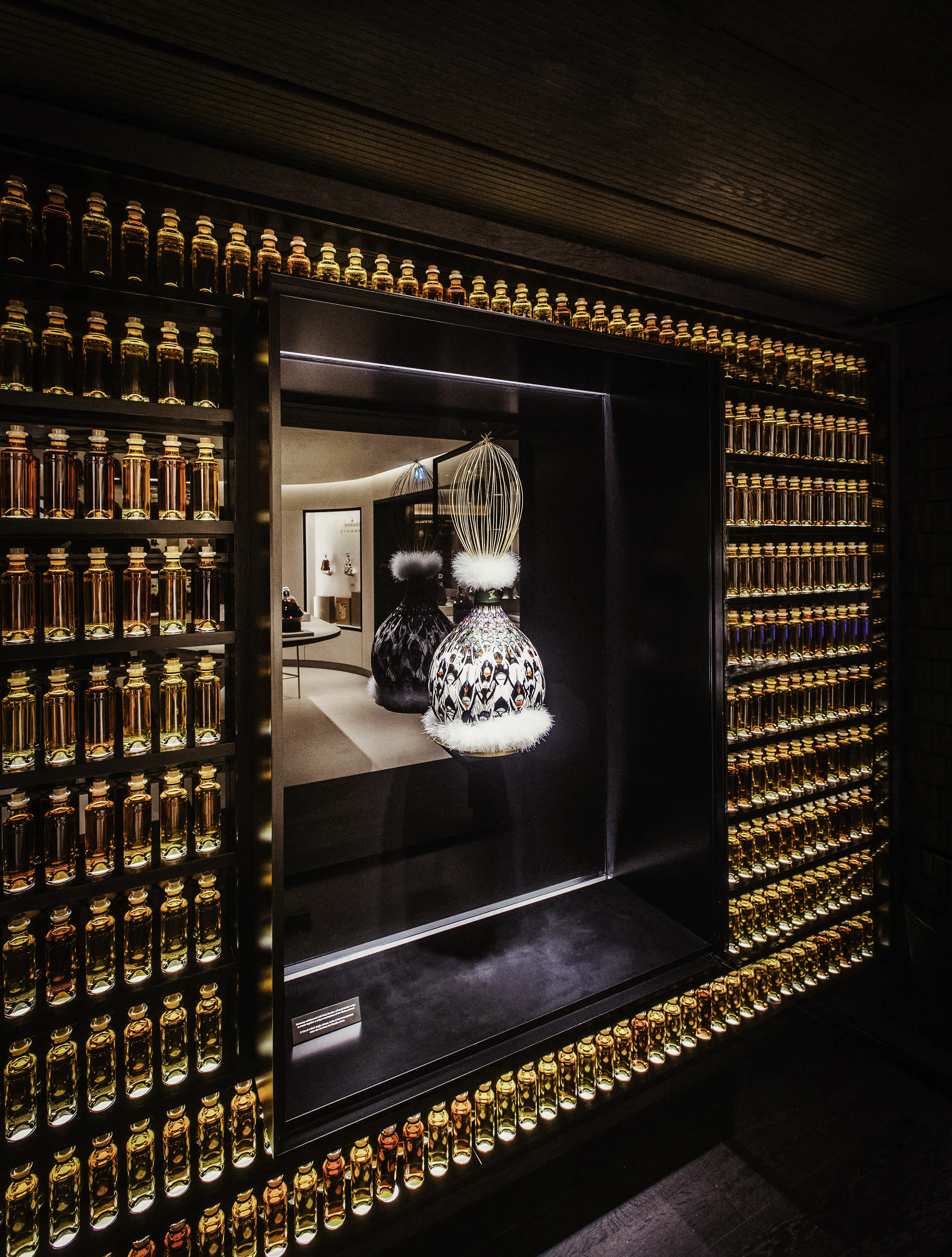
Finally, a third product layer creates a unique spatial character by highlighting the items on display. The nature of Hennessy’s liquid products and faceted glass bottles resulted in the design team integrating light sources into the cognac bottles and vials, based on additional mock-ups and testing to validate the concept. The subsequent scheme enhances the amber tones of the cognac while also capturing the faceted nature of the glass. Additional illumination integrated into a screen behind an artistic glass Paradis silhouette reinforces the dynamic transformation of light through the dozens of bottles on display.
Combined, the layers of light transform a traditional retail space into a modern, high-end gallery showcasing iconic, glowing products, setting the stage for the curated retail experience of Hennessy’s next era.
Design Architect
CiguëArchitect of Record
INK AssociatesStatus
CompletedDate Completed
2022
Client
Principal
Project Leader
Team
Photo Credit
Courtesy of Hennessy
